|
For the Analyst:
 The term analyst often conjures images of bookish people, wearing coke-bottle
glasses, wielding very sharp pencils to calculate the most obscure statistics.
While this image is widely held, it distracts us from recognizing the purest,
most practical, and easiest form of analysis: Graphical Analysis.
The term analyst often conjures images of bookish people, wearing coke-bottle
glasses, wielding very sharp pencils to calculate the most obscure statistics.
While this image is widely held, it distracts us from recognizing the purest,
most practical, and easiest form of analysis: Graphical Analysis.
The human brain is a powerful graphical engine, and quickly recognizes patterns in images.
The brain can instantly recognize important facts about visual data without calculating anything.
When data are presented graphically, for example in a run chart, one can very quickly
identify trends; a rising or falling trend, a steady condition without change, or disorganized
data with lots of variation.
Everyone can be an analyst, and LiveSPC.com provides an easy way to build
Your Enterprise Visual Workplace™ with simple, yet powerful, graphical representations
of your enterprise data. Your brain does the rest! No messy calculations, no complicated
analytical software... just your data, in picture form, ready to digest.
So you, the Analyst, have a couple of questions to answer:
- What data should I measure and collect?, and
- How should I represent the data?
Enterprise Data
Results are King in any enterprise, so they should be measured:
- Revenue
- Order Fulfillment Time
- On-Time Performance
- Backorder Value
- Product Quality
- Customer Satisfaction
- Project Earned Value
What you count as results in your business is unique and varied, but always reflects
some output of the business. Business financials are a natural here, but those measures of
performance valued by your Customers are also very important, like order fulfillment times and other
product quality measurements. You may even want to brag about these results by embedding LiveSPC
workspaces on your own website.
For companies involved in larger development projects, or built-to-order products, it may be useful
to measure and communicate project performance metrics like earned value, bug counts, or problem reports.
These represent work completed or accrued work backlog.
Companies managing operations benefit from monitoring the inputs to their operations,
or resources required for production, like:
- Server Availability
- Active Website Sessions
- Registered Users
- Network Performance
- Key Materials Inventory
Inputs are anything your enterprise requires to operate effectively and efficiently.
Anything critical to your operation, those things you cannot function without, should be measured.
Once you have a wish-list of data you'd like to collect visit your IT or Systems department to
arrange to have them configure a live feed of your data to LiveSPC.com.
Data Representations
Once you've got your data fed to datasets on LiveSPC you can construct reports that display
that data in a form that best suits your need. The following table describes the available
graphical representations for your data, when to apply them, and what analyses they enable.
|
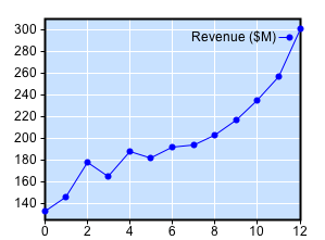
Run Chart
The Run chart is a basic depiction of a sequence of measured samples. This form enables
the identification of trends, increasing, decreasing, steady, or disorganized progress.
|
 |
|
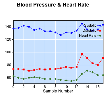
Multiple numerical samples can be plotted from the same dataset. Each column in the dataset
will be drawn and labeled separately.
|
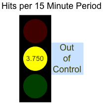
Stop Light
The Stop Light shows, at a glance, the status of a process being measured by displaying
Red when the current sample exceeds specified limits, Yellow if the process exhibits special-cause
variation, or Green when everything is in order.
|
 |
|
Any numerical data can be displayed as a Stop Light. Specifying limits for the dataset is
required for the annunciation of the Red "out-of-spec" condition.
|
Gas Gauge
The Gas Gauge is a familiar form that displays the current sample value on an analog scale
with specified limits (red zone) and control limits (yellow zone) to help identify problems
with the underlying process.
|
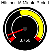 |
|
Any numerical data can be displayed as a Gas Gauge. Specifying limits for the dataset is
required for displaying the Red "out-of-spec" zone.
|
Histogram
The histogram shows how sample values are distributed in the dataset. As a reference, a normal
distribution line is drawn in blue, which enables quick determination of how the samples vary.
|
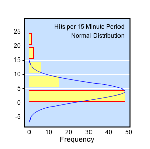 |
| Any numerical data can be displayed in this form. |
Basc Stats
The Basic Stats Chart presents a summary of statistics for the dataset organized by
column or observation. Each observation/column in the dataset is analyzed
and displayed as a column in the stats.
|
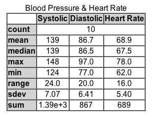 |
|
Any numerical data can be analyzed and displayed.
|
Pareto Chart
The Pareto Chart analyzes the frequency of occurance of values in the dataset. The
Values are sorted from most frequent to least frequent. An (others) bin is provided
to capture small remaining numbers of values.
|
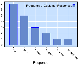 |
|
Any textual or numerical data can be analyzed and displayed. Best used on discrete
sets of values like single words or short phrases. Numerical values may contain many
discrete values.
|
Control Charts
The following representations are "Control Charts."
These charts provide a quick graphical way to determine when unusual variation is
occurring in the sample data. Any sample falling outside of the Control limits is
colored red and indicates "Special Cause" variation.
Special-cause variation indicates that something significant has changed in the data,
either due to a change in process or the way it is measured.
See "Control Charts"on Wikipedia.
Other patterns in the data can also indicate special-cause variation. The "Western-Electric Rules"
capture how to identify these patterns.
See "Western-Electric Rules"on Wikipedia.
|
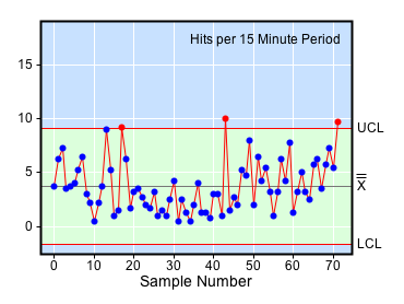
X-Bar Chart
The X-Bar Chart depicts the dataset as a sample sequence, with the addition of upper and lower
control-limit lines. Points falling outside of the control limits are a sign of special-cause
variation resulting from non-random sources.
|
 |
|
Samples of up to 10 observations in a subgroup (10 columns) can be displayed. Each plotted
point represents the average of all the observations in the sample.
|
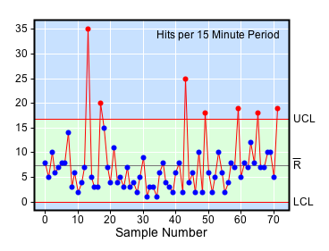
R Chart
The R Chart is a companion to the X-Bar Chart that indicates when special-cause variation
occurs within the observations that constitute a sample. These sample observations are
usually called a "subgroup."
|
 |
|
Each plotted point represents the range of values in the sample subgroup. For samples
containing a single observation the difference between samples is used.
|
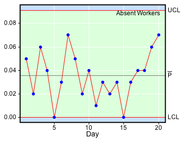
P Chart
The P Chart is a Control Chart used to analyze defects described by the number of
samples that represent failures, and the total number of samples. The fraction defective
is displayed.
|
 |
|
The dataset being analyzed must have two columns defined: the first column must
contain the number of defects in the sample population, and the second must
contain the sample population.
|
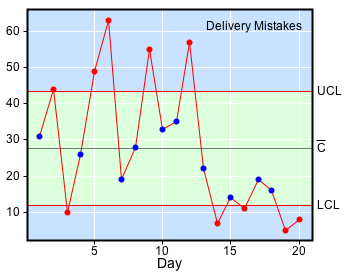
C Chart
The C Chart is used to analyze variation in count data.
|
 |
|
Observations in each sample are summed and plotted with control limits. A constant sample
population is assumed.
|